Delving Into The Psychology Of Shop Design
Retailers have been using psychology in shop design for decades, and the results of doing so speak for themselves – when you think like your consumers, you’re way more likely to get sales right. Experts have studied this field in great detail, and have developed some fantastically subtle psychological design basics. For retailers, implementing these basics can bring two primary benefits to the fore – improved shopping experiences for any consumers, and the potential of significantly increased sales.
But, what do you need to know about the effective, mutually-beneficial psychology of shop design?
# 1 – Color is Crucial
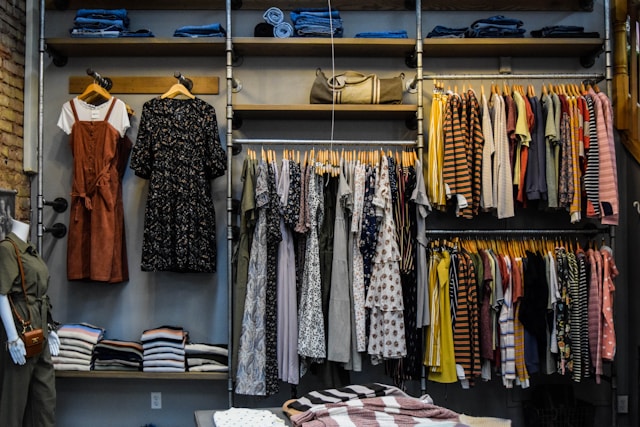
According to a study conducted in the early 2000s, 62-90% of first impressions in marketing are based on color alone. This is why color psychology is a great first step for anyone looking into a more mind-based retail design. This is great news generally, as splashes of color are always a welcome addition for your customers. More subtly, the right color choices can also incite consumers into taking certain actions.
For instance, red can create a sense of urgency, which increases the chances of impulse buying. Meanwhile, orange can boost happiness, and yellow can draw the eye. By being smart about how you position these colors around your store (e.g. using yellow in your window displays and red by your tills), you could see a significant sales boost. What’s more, you can tailor that sales boost towards your store targets, whether those centre around attracting new customers, or increasing impulse or secondary purchases.
# 2 – Shelving should work for you
It’s not rocket science to realize that the order of shop shelving can impact how consumers move through your store. That’s just physics. But, you can also get psychological about this with certain shelving tricks, such as:
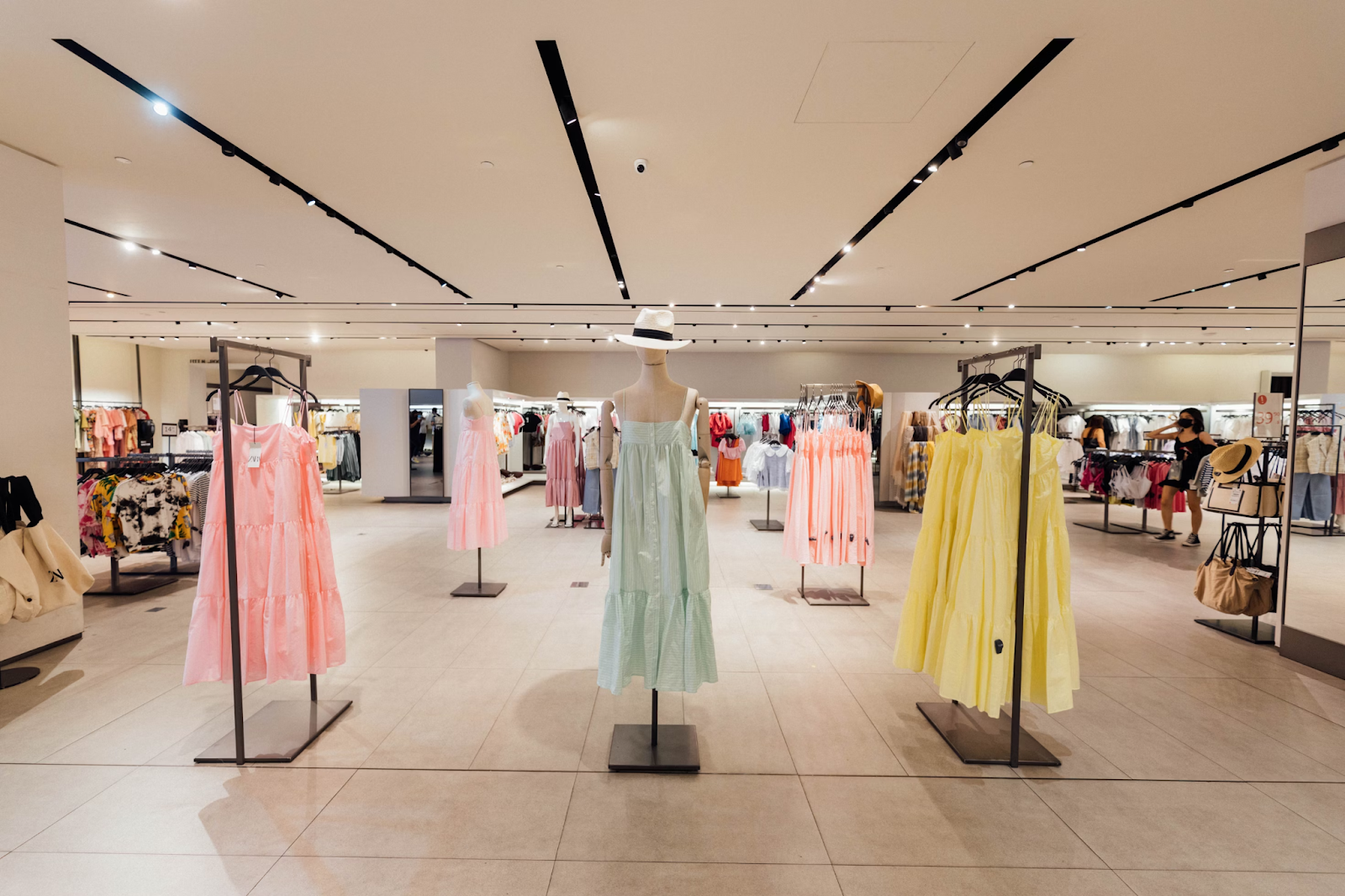
- Creating a ‘decompression zone’: A decompression zone is essential for helping consumers to move from the outside world, into the world of your store. Try to position shelving a little away from your entrance, so consumers can adjust before they begin browsing.
- The right-side technique: The majority of your consumers will be right-handed. Placing crucial shelves, such as those including promotions or high-end products, directly to the right of your entrance could see them receiving more attention, as consumers naturally turn this way.
- Don’t be afraid to guide them: While you need to make sure you’re giving your consumers plenty of space to move around, it’s worth positioning shelving in suggestive ways, such as creating corridors with your shelf positioning. This can help you ensure consumers move from your more impressive products when they start browsing, to things like low-spend impulse buys as they get closer to the tills.
- Think product positioning: Product positioning is perhaps the oldest retail psychology trick there is. It involves placing more expensive or impressive products at eye level, making consumers more likely to choose them.
# 3 – Be Subtle With Branding
Branding is crucial in store design, but it should always be a subtle addition. Most consumers will avoid overtly branded spaces or clothing that’s smothered in brand logos. Instead, it’s worth finding more subtle ways to get your brand name and logo into people’s minds while they browse. Colour is a great way to do this, as using brand colouring in your store will make you recognisable, even if your logo doesn’t appear. Equally, investing in tastefully designed brand labels that use sticker printer paper enables you to subtly apply your logo to product labels or packaging. This ensures that consumers notice and remember your logo, even if they’re not aware of it happening at the time.

# 4 – Work on Your Lighting
Store lighting is also hugely important to design psychology. Most commonly, we see this in supermarkets, which use bright strip lighting to incite faster, more impulsive purchases. In a smaller store, such bright lighting could end up preventing consumers from entering at all. But, lighting can still work for you if you approach it in the right way.
In fact, studies have revealed that the right lighting can improve product perception. To achieve this in your retail space, aim to create an ambience using subtle lighting that complements your colour choices and overall design. It’s also worth using the positioning of your lights to highlight key products or direct how your consumers shop.
The psychology of shop design is endlessly fascinating, and it could improve perceptions and shopping experiences in your store. Consider these factors during your next redesign.


